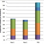
How to Create Compelling Charts in Excel
A good chart can “land” you the client, separate you from other vendors, or make your message to management extremely persuasive. Some people have an intuitive eye for what looks good, but when we see someone put a bunch of numbers on a slide, we know they need help.
We have some simple rules and steps for creating charts. Some of these details are in an earlier post. This VIDEO shows you EXACTLY how to create good Microsoft Excel charts. Here is part 1 of a 3 part series on how to create compelling charts in Excel. Enjoy!
The videos are loaded in both Windows Media file and QuickTime to ensure maximum compatibility.
What other steps should be included? Please share with the community in the comments.

one can argue that it can go both ways
If you could e-mail me with a few suggestions on just how you made your blog look this excellent, I would be grateful.
found your site on del.icio.us today and really liked it.. i bookmarked it and will be back to check it out some more later